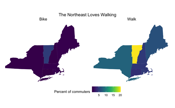
After some cleaning of the data, we can see that in New York and Vermont a decent percentage of communters walk to work. Interesting to see that Vermont commuters also bike to work more frequently.
#Modes of travling biking and walking ACS data
commute_mode <- readr::read_csv("https://raw.githubusercontent.com/rfordatascience/tidytuesday/master/data/2019/2019-11-05/commute.csv")
## Rows: 3496 Columns: 9
## ── Column specification ────────────────────────────────────────────────────────
## Delimiter: ","
## chr (6): city, state, city_size, mode, state_abb, state_region
## dbl (3): n, percent, moe
##
## ℹ Use `spec()` to retrieve the full column specification for this data.
## ℹ Specify the column types or set `show_col_types = FALSE` to quiet this message.
commute_mode$state <- recode(commute_mode$state,
                       "Ca"= "California",
                       "Massachusett" = "Massachusetts")


#summarise data each state for percent biking and walking
commute_summary <- commute_mode %>%
  mutate(state = tolower(state)) %>%
  group_by(state, mode) %>%
  summarise(Percent = mean(percent))
## `summarise()` has grouped output by 'state'. You can override using the `.groups` argument.
#retrieve state geo data
states_map <- map_data("state")

#filter by Northeastern States
NE_states <- subset(states_map, region %in% c("connecticut", "massachusetts","maine", "new hampshire",
                                          "new york", "rhode island", "vermont"))
#plot by new england states
commute_summary %>%
  ggplot(aes(map_id = state)) +
  geom_map(aes(fill=Percent), map = NE_states)+ #sets up map
  facet_wrap(vars(mode)) + #displays both bike and walk on same figure
  expand_limits(x= NE_states$long, y=NE_states$lat)+ #sets limits based on lat/long of states file
  coord_map("polyconic") +
  scale_fill_viridis(option = "D") +
  theme_void()+ #gets rid of xy grid
  labs(fill = "Percent of commuters", title= "The Northeast Loves Walking")+
  theme(legend.position="bottom", plot.title = element_text(hjust =0.5),
        strip.text.x = element_text(size = 12))#changes text of mode

commute_summary
## # A tibble: 102 × 3
## # Groups:   state [51]
##    state      mode  Percent
##    <chr>      <chr>   <dbl>
##  1 alabama    Bike    0.235
##  2 alabama    Walk    1.33
##  3 alaska     Bike    1.43
##  4 alaska     Walk    5.03
##  5 arizona    Bike    0.724
##  6 arizona    Walk    2.10
##  7 arkansas   Bike    0.155
##  8 arkansas   Walk    2.05
##  9 california Bike    0.983
## 10 california Walk    2.36
## # … with 92 more rows
In contrast to Northeast, Southeast commuters do not seem to prefer biking or walking to work.
#filter by southeastern states
SE_states <- subset(states_map, region %in% c("alabama", "florida", "georgia", "kentucky", "mississippi",
                                              "north carolina", "south carolina", "tennessee", "virginia"))

commute_summary %>%
  ggplot(aes(map_id = state)) +
  geom_map(aes(fill=Percent), map = SE_states)+
  facet_wrap(vars(mode)) +
  expand_limits(x= SE_states$long, y=SE_states$lat)+
  coord_map("polyconic") +
  scale_fill_viridis(option = "D") +
  theme_void()+
  labs(fill = "Percent of commuters", title= "The Southeast Hates Walking")+
  theme(legend.position="bottom", plot.title = element_text(hjust =0.5),
        strip.text.x = element_text(size = 12))

To simplifiy the color scheme, I gropued the percentage of walking. It is surprising to see that West Virginia seems to be a big walking-to-work state.
#group dataset by % groups
commute_summary$Group[commute_summary$Percent <= 2] = "1"
## Warning: Unknown or uninitialised column: `Group`.
commute_summary$Group[commute_summary$Percent >= 2 & commute_summary$Percent <= 3] = "2"
commute_summary$Group[commute_summary$Percent >= 3 & commute_summary$Percent <= 4] = "3"
commute_summary$Group[commute_summary$Percent >= 4 & commute_summary$Percent <= 5] = "4"
commute_summary$Group[commute_summary$Percent >= 5 & commute_summary$Percent <= 6] = "5"
commute_summary$Group[commute_summary$Percent >= 6] = "6"

#change group category to Numeric so map can be colored with group #
commute_summary$Group <- as.numeric(commute_summary$Group)

#seperate 'mode' into bike and walk
commute_Walk <- dplyr::filter(commute_summary, mode == "Walk")

#Map of groups for % walking
commute_Walk %>%
  ggplot(aes(map_id = state)) +
  geom_map(aes(fill=Group), color="black", map = states_map)+
  expand_limits(x= states_map$long, y=states_map$lat)+
  coord_map("polyconic") +
  scale_fill_viridis(option = "D") +
  theme_void()+
  labs(fill = "Percent of commuters", title= "Walking to Work by State")+
  theme(legend.position="bottom", plot.title = element_text(hjust =0.5))

 Northeast Walkability