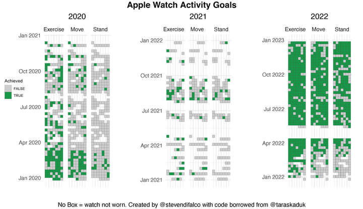
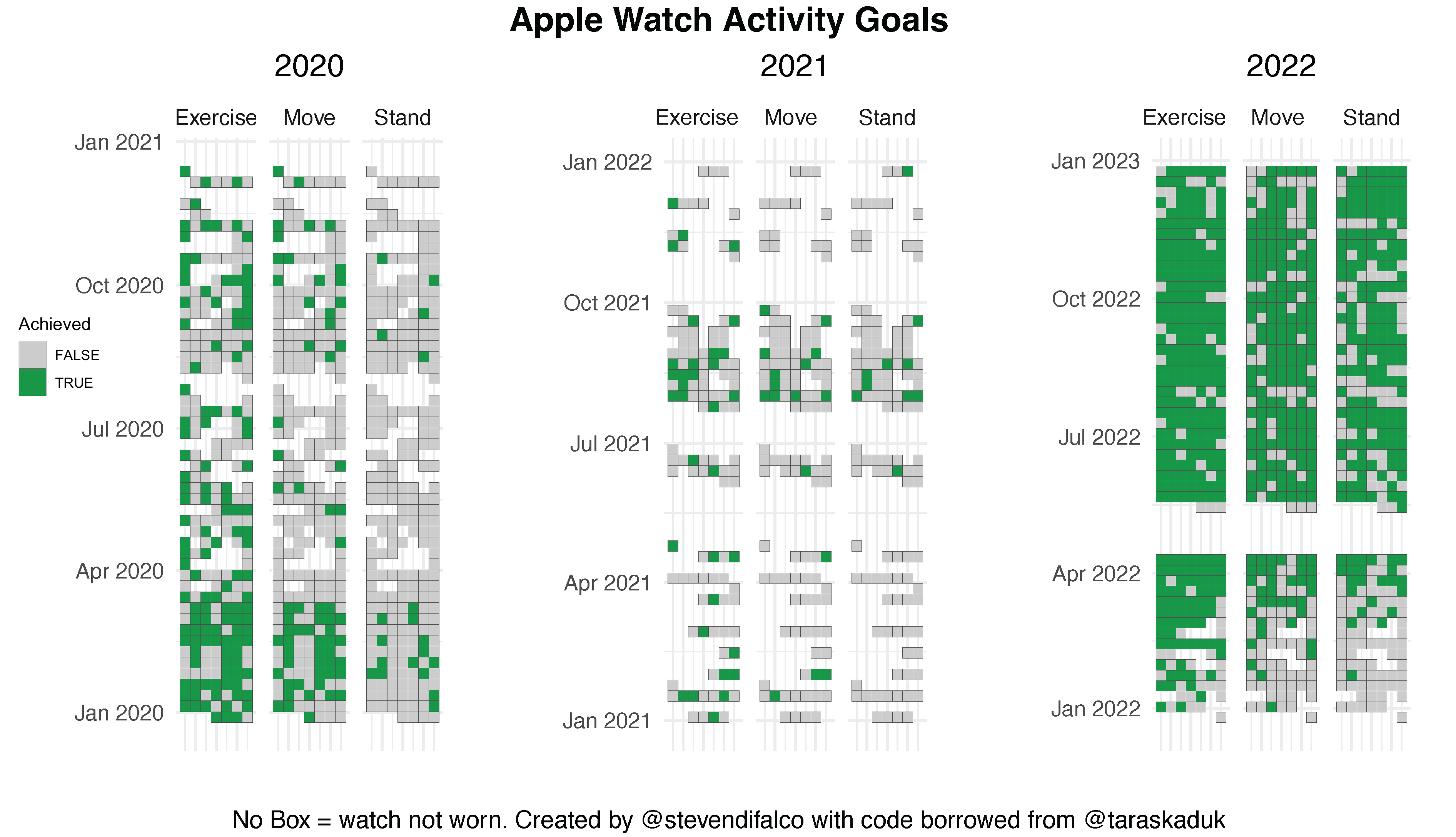
This data set is my personal Apple Health Data from the past 3 years. For how to download your data see Taras Kaduk’s Post, which is also where much of this code was sourced from.
#libraries
library(XML)
library(tidyverse)
library(lubridate)
library(scales)
library(ggthemes)
library(ggpubr)

#xml object containing data
xml <- xmlParse(file = "apple_health_export/export.xml")

#set up dataframes for types of data
df_record <-XML:::xmlAttrsToDataFrame(xml["//Record"])
df_activity <- XML:::xmlAttrsToDataFrame(xml["//ActivitySummary"])
df_workout <-  XML:::xmlAttrsToDataFrame(xml["//Workout"])
df_workoutstats <- XML:::xmlAttrsToDataFrame(xml["//WorkoutStatistics"])

#Separate out dateComponent into year, month, day. Easier to group category and set up boolean.
df_activity_cleaned<-df_activity %>%
  mutate(date = as.Date(dateComponents)) %>%
  select(-dateComponents) %>%
  select(-activeEnergyBurnedUnit) %>%
  mutate_if(is.character, as.numeric) %>%
  rename(move = activeEnergyBurned,
         exercise = appleExerciseTime,
         stand = appleStandHours,
         move_goal = activeEnergyBurnedGoal,
         exercise_goal = appleExerciseTimeGoal,
         stand_goal = appleStandHoursGoal) %>%
  mutate(year = lubridate::year(date),
         month = month(date),
         day = day(date),
         wday = wday(date),
         move_pct = move/move_goal,
         exercise_pct = exercise/exercise_goal,
         stand_pct = stand/stand_goal,
         move_bool = if_else(move_pct < 1, FALSE, TRUE),
         exercise_bool = if_else(exercise_pct < 1, FALSE, TRUE),
         stand_bool = if_else(stand_pct < 1, FALSE, TRUE))

#pivots data, arranges by category, and adds boolean record
df_activity_tall_bool <- df_activity_cleaned %>%
    select(date, Move = move_bool, Exercise = exercise_bool, Stand = stand_bool) %>%
    gather(category, boolean, -date)

#resets date fields and adds a week category for organizing plots
df_activity_tall <- df_activity_tall_bool %>%
    left_join(df_activity_tall_bool, by = c("date", "category")) %>%
    mutate(month = ymd(paste(year(date), month(date), 1, sep = "-")),
           year = year(date),
           week = date - wday(date) + 1,
           wday = wday(date),
           day = day(date)) %>%
    filter(year %in% c("2020","2021","2022"))
#Plot set up - filter each year and create plot per year. Not sure how to facet this.
df_2020 <- df_activity_tall %>%
  filter(year == 2020)

A2020 <- df_2020 %>%
  ggplot(aes(x = wday, y = week, fill= boolean.x)) +
  geom_tile(col = "grey30", na.rm = FALSE) +
  theme(panel.grid.major = element_blank()) +
  scale_fill_manual(values = c("grey80", "#1a9641")) +
  facet_wrap(~ category)+
  coord_fixed(ratio = 0.15) +
  guides(fill="none") +
  ggtitle("2020") +
  xlab("")+
  ylab("")+
  theme_minimal()+
  theme(axis.text.x = element_blank())+
  theme(plot.title = element_text(hjust = 0.5))

df_2021 <- df_activity_tall %>%
  filter(year == 2021)%>%
  arrange(date)

A2021 <- df_2021 %>%
  ggplot(aes(x = wday, y = week, fill= boolean.x)) +
  geom_tile(col = "grey30", na.rm = FALSE) +
  theme(panel.grid.major = element_blank()) +
  scale_fill_manual(values = c("grey80", "#1a9641")) +
  facet_wrap(~ category)+
  coord_fixed(ratio = 0.15) +
  guides(fill="none") +
  ggtitle("2021") +
  xlab("")+
  ylab("")+
  theme_minimal()+
  theme(axis.text.x = element_blank())+
  theme(plot.title = element_text(hjust = 0.5))

df_2022 <- df_activity_tall %>%
  filter(year == 2022)%>%
  arrange(desc(date))

A2022 <- df_2022 %>%
  ggplot(aes(x = wday, y = week, fill= boolean.x)) +
  geom_tile(col = "grey30", na.rm = FALSE) +
  theme(panel.grid.major = element_blank()) +
  scale_fill_manual(values = c("grey80", "#1a9641")) + #, labs("Achieved")) +
  facet_wrap(vars(category), labeller = )+
  coord_fixed(ratio = 0.15) +
  guides(fill="none") + #first include the labels above first then turn off guides
  ggtitle("2022") +
  xlab("")+
  ylab("")+
  theme_cowplot()+
  theme(axis.text.x = element_blank())+
  theme(plot.title = element_text(hjust = 0.5))

#get legend from plot- have to include first then do extract
my_legend <- get_legend(A2022)
legend <- as_ggplot(my_legend)

#Arrange output for export
arrangedPlots <- ggarrange(A2020, A2021, A2022,
                    ncol = 3)

annotate_figure(arrangedPlots, top = text_grob("Apple Watch Activity Goals", color="black", face = "bold", size = 14),
                bottom = text_grob("No Box = watch not worn. Created by @stevendifalco with code borrowed from @taraskaduk", color="black",size=10))

ggsave("legned.png",legend, width=1, height=1)