Chocolate Ratings-Tidy Tuesday Week 3
This week for #TidyTuesday the dataset comes from Flavors of Cacao. Interesting set of information on chocolate ratings from across the world. Code below the figures.
I first wanted to look at the data statistically. I was curious if percent of cocoa in the chocolate was related to the rating. Looks like there is a significant relationship.

I then took a what other factors are possibly influencing the rating, including cocoa percent and different ingredients in the chocolate. Containing vanilla and cocoa butter are possibly influencing the chocolate ratings.

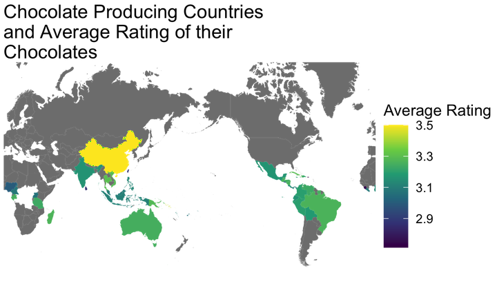
To look at the data differently, I plotted the average rating of the chocolate based on it’s origins. There were multiple chocolates that were blends from different countries, which do not factor into this. There is also an error in the mapping which left some countries out.

# TidyTuesday Week 3, 2022
# Chocolate Flavor Data

library(tidytuesdayR)
library(tidyverse)
library(ggplot2)
library(sjPlot)
library(RColorBrewer)
library(maps)

#data
tuesdata <- tidytuesdayR::tt_load('2022-01-18')

chocolate <- tuesdata$chocolate

#convert cocoa_percent to a numeric
chocolate <- chocolate %>%
  mutate(
    cocoa_percent = str_extract(cocoa_percent, "\\d+") %>%
      as.numeric()
    )%>%
  mutate(country_of_bean_origin=
           recode(country_of_bean_origin,
                  "Congo"= "Republic of Congo",
                  "DR Congo"= "Democratic Republic of the Congo")
         )

#parse out ingredients by name and assign them binary coding for presence/absence
#from Jesus Castagnetto (https://github.com/jmcastagnetto/tidytuesday-kludges/blob/main/2022-01-18_chocolate/01-get-data.R)
chocolate_df<- chocolate %>%
   mutate(
     n_ingredients = str_extract(ingredients, "\\d") %>% as.numeric(),
     ingredients_list = str_extract(ingredients, "[A-Za-z,*]+")
     ) %>%
  separate_rows(
    ingredients_list,
    sep = ","
  ) %>%
  mutate(
    ingredients_list = str_replace_all(
      ingredients_list,
      c(
        "^S\\*$" = "sweetener",
        "^S$" = "sugar",
        "C" = "cocoa_butter",
        "V" = "vanilla",
        "B" = "beans",
        "L" = "lecithin",
        "^Sa$" = "salt"
      )
    ),
    ingredients_list = replace_na(ingredients_list, "unknown"),
    flag = 1
  ) %>%
  pivot_wider(
    names_from = ingredients_list,
    values_from = flag,
    values_fill = 0
  )


#simple plot of rating vs cocoa%
graph <- ggplot(chocolate_df, aes(x = cocoa_percent, y = rating)) +
  geom_point() +
  stat_smooth(method = "lm", col = "red")+
  labs(x='Cocoa Percent', y='Rating', title='Linear Regression Plot') +
  theme(plot.title = element_text(hjust=0.5, size=20, face='bold'))+
  theme_minimal()+
  annotate("text", x = 45, y = 1.1, label = "italic(R) ^ 2 == 0.021", parse= TRUE)
graph


#testing what predicts rating, if there are correlations
model1 <- lm(rating ~
               cocoa_percent,
             data= chocolate_df
               )
summary(rating)

model2 <- lm(rating ~
                cocoa_percent+
                sweetener+
                sugar+
                cocoa_butter+
                vanilla+
                beans+
                lecithin+
                salt,
              data=chocolate_df)

model3 <- lm(rating ~
                sweetener+
                sugar+
                cocoa_butter+
                vanilla+
                beans+
                lecithin+
                salt,
              data=chocolate_df)

#creating table to view results
tab_model(model1, model2, model3,
          dv.labels = c("Model 1", "Model 2", "Model 3"),
          show.ci= FALSE,show.est=F,
          show.std=T, show.stat=T, show.p= TRUE, p.style = "stars",
          string.pred = "Rating",
          string.std="B", string.stat="p")


#summarise by country
chocolate_df2 <- chocolate_df %>%
  group_by(country = country_of_bean_origin)%>%
  summarise(avg_rating=mean(na.omit(rating)),
            avg_cocoa=mean(na.omit(cocoa_percent)))

#brought in all country names due to error in making map with only those that export cocoa beans
countries <- read_csv("2022-01-18/countries.csv")

chocolate_df2 <- right_join(chocolate_df2, countries, by="country")

#retrieve country geo data
world <- map_data("world2")%>%
  filter(region != "Antarctica")

#world map
worldmap <- chocolate_df2 %>%
  ggplot(aes(map_id=country))+
  geom_map(aes(fill=avg_rating), map=world)+
  expand_limits(x= world$long, y=world$lat)+
  scale_fill_continuous(type = "viridis")+
  coord_map("mercator")+
  labs(fill = "Average Rating", title= str_wrap("Chocolate Producing Countries and Average Rating of their Chocolates", 30))+
  theme(legend.position="bottom", plot.title = element_text(hjust =0.5))+
  theme_void()
ggsave("featured.png")Steven DiFalco
GIS and Land Data Manager
My interests include botany, geography, human dimensions, and landscape ecology.